
Պատկեր:PercentOfUSPopInEachState.gif

Նախադիտման չափ՝ 800 × 520 պիքսել։ Այլ թույլտվությաններ: 320 × 208 պիքսել | 640 × 416 պիքսել | 1024 × 665 պիքսել | 1513 × 983 պիքսել.
Սկզբնական նիշք (1513 × 983 փիքսել, նիշքի չափը՝ 710 ԿԲ, MIME-տեսակը՝ image/gif, looped, 25 frames, 13 վ)
Ամփոփում
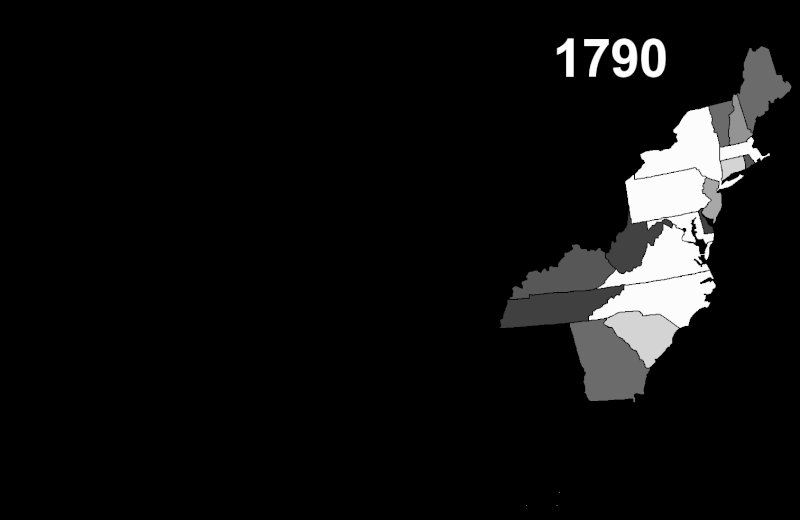
| Նկարագրում | This map shows the historical movement of the US population among the various states and territories. Brighter states have a larger share of the national population; darker states have a smaller share. |
| Թվական | |
| Աղբյուր | My own work, US Census data, PD Map |
| Հեղինակ | Szu |
| Իրավունքներ (Նիշքի վերաօգտագործումը) |
Public domain |
Արտոնագրում
| I, the copyright holder of this work, release this work into the public domain. This applies worldwide. In some countries this may not be legally possible; if so: I grant anyone the right to use this work for any purpose, without any conditions, unless such conditions are required by law. |
Նիշքի պատմություն
Մատնահարեք օրվան/ժամին՝ նիշքի այդ պահին տեսքը դիտելու համար։
| Օր/Ժամ | Մանրապատկեր | Օբյեկտի չափը | Մասնակից | Մեկնաբանություն | |
|---|---|---|---|---|---|
| ընթացիկ | 22:15, 11 Հոկտեմբերի 2007 | | 1513 × 983 (710 ԿԲ) | Szu | {{Information |Description=Lighter states have a larger share of the US population; darker states have a smaller share. |Source=My own work, US Census data, PD Map |Date=Oct 11 2007 |Author=Szu |Permission=Public domain |other_versions= }} |
Նիշքի օգտագործում
Հետևյալ էջը հղվում է այս նիշքին՝
Նիշքի համընդհանուր օգտագործում
Հետևյալ այլ վիքիները օգտագործում են այս նիշքը՝
- Օգտագործումը en.wikipedia.org կայքում
- Օգտագործումը fr.wikipedia.org կայքում
- Օգտագործումը ka.wikipedia.org կայքում
- Օգտագործումը ru.wikipedia.org կայքում
- Օգտագործումը xmf.wikipedia.org կայքում